Improving Player Accessibility
Summary
I improved SoundCloud's player accessibility by addressing color contrast issues while maintaining the same look and feel of the original design. Using the STAR method (Situation, Task, Action, Result), I explored various design solutions, ultimately enhancing button clarity with a polished bottom bar that preserves artwork visibility. It involved collaboration with engineering and product teams, aligning with SoundCloud's principle of prioritizing content over design.
- Company
- SoundCloud
- Role
- Sr. Product Designer — Design Systems
- Year
- 2022
About SoundCloud
it is an online audio & streaming platform based in Berlin. one of the most recognized names in the music industry. And as we say... What's next in music is first on SoundCloud. it's currently a subscription business model. selling subscription plans for consumers & audio creators. while now it's looking into changing towards creator & fan economy to be more community-based.
Fade in
Our media player was not great in terms of color accessibility and our team thought it was vital to address this. Because our new design language was built with accessibility in mind. Some parts were pushed to post-MVP, Which is ok. After all, Design System work is never done.
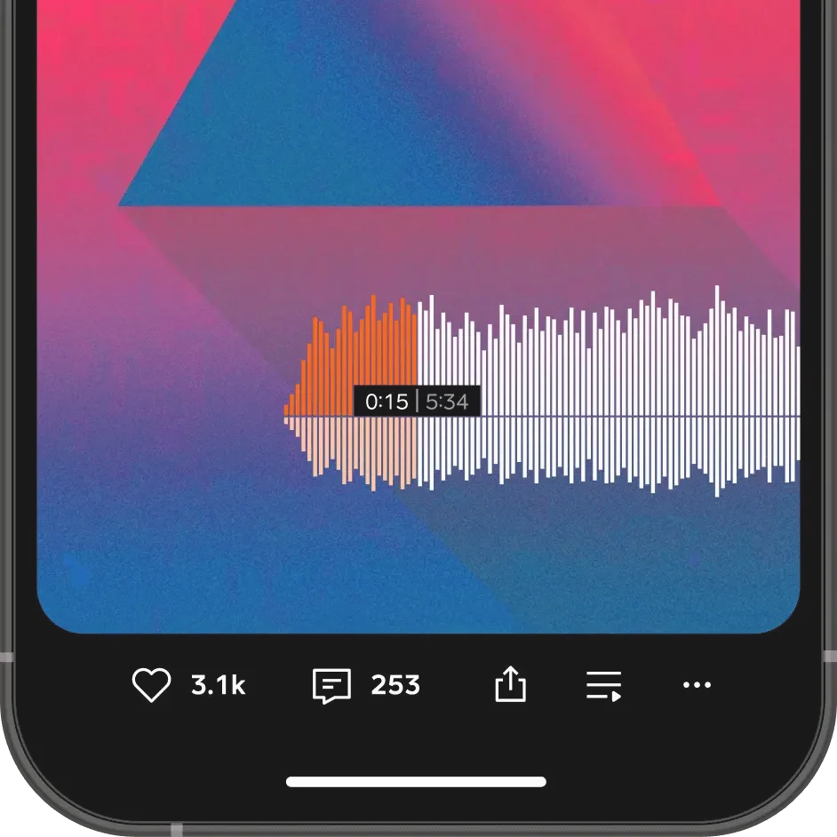
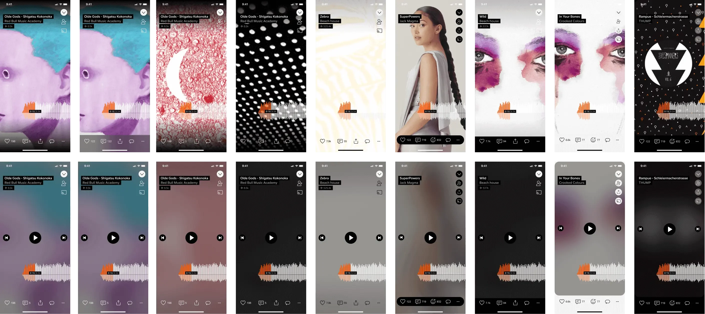
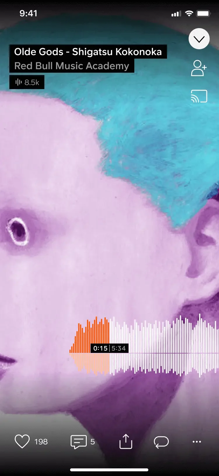
Below is what it currently looks like. Timed commenting and the waveform are iconic and very unique to the SoundCloud experience.
SoundCloud Audio Player
Zooming in on some parts:
- It's pretty hard to see these icons and buttons at the bottom.
- Similarly on the top right. some buttons aren't very clear.
The problem with the player
Which existed like that forever and probably has a negative impact on engagement.
STAR method
For this project walkthrough, I'll be using the STAR method
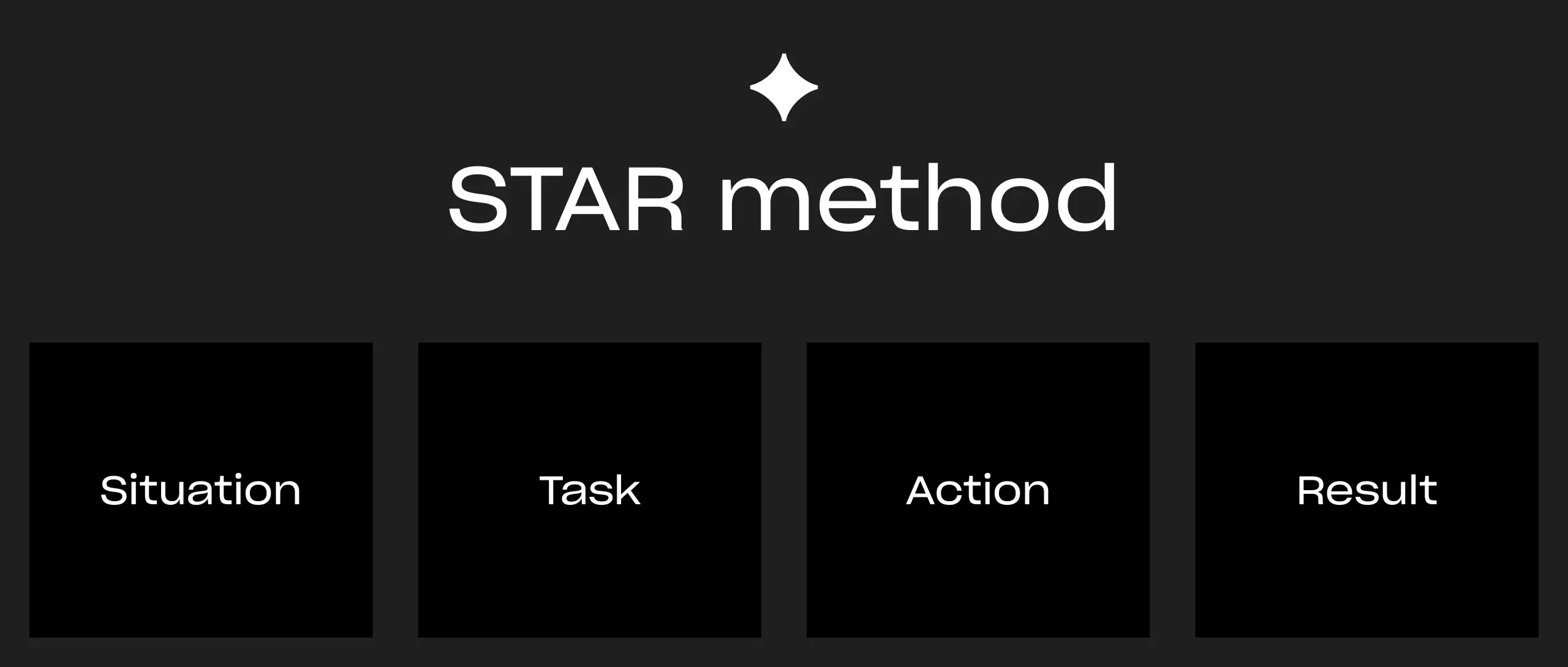
STAR method
1. Situation
It was tricky to work on, we had to fix color contrast problems without too many significant design changes. Make sure listen time, likes or any engagement metrics don’t dip. because More than 80% of all likes happen within the player!
2. Task
My task was to explore various solutions to the color accessibility problem with known limitations.
3. Action
- Explore design solutions.
- Involve Android engineering to understand what's possible because Android was ahead in its design system implementation, we can test it and then expand that solution to other platforms.
- Get help from the Product & Data teams to support us in running an experiment. New design concept vs the current version.
- In that experiment, we Monitor listening time and engagement metrics to determine a winner.
4. Exploration
I did so many explorations, so let's jump into a few of them and understand how we chose the winner.
Exploration overview
Concept 1
We already had a subtle gradient overlay on top of the artwork, so I increased it and made it stronger hoping it would solve the problem but it didn't.
- The Gradient looks too dirty and destroys the artwork
- Wouldn’t work on all use cases like busy or messy artwork
concept 1
Concept 2
Add a background blur instead? almost worked...
- It covers too much of the artwork
- Not always accessible unless we darken the blurred background too much
Concept 2
Concept 3
change the UI based on how light or dark the artwork is. Was an interesting idea and thought it would work.
- Might introduce UI flickering as we don't know before opening the page if the UI should be light or dark.
- It didn't work on busy artwork because we can't determine if the UI should be light or dark.
Concept 3
And here's an example of a busy/messy artwork. As you can see I can't determine if it should be light or dark, so this concept won't help us.
Busy/messy artwork example
Concept 4, The pill:
Again, covers too much of the artwork and doesn't match our design principles.
Concept 4
Concept 5
Mimic a bottom nav bar for actions? hmm...
This one felt like we were getting somewhere but it still covered too much of the artwork but it led me to the next idea.
Concept 5
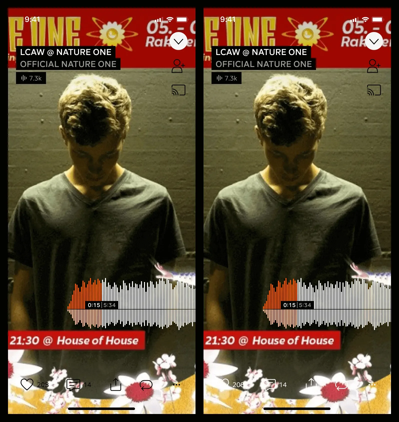
Concept 6, The polished bottom bar:
with this one, I scaled down the artwork so the bottom bar doesn't cover much of the artwork anymore. Works on all use cases!
Concept 6
Another reason why I chose this concept, is that it relates to one of our design principles. "Content, even over design"... We wanted our design to be content first, so our design steps out of the way...
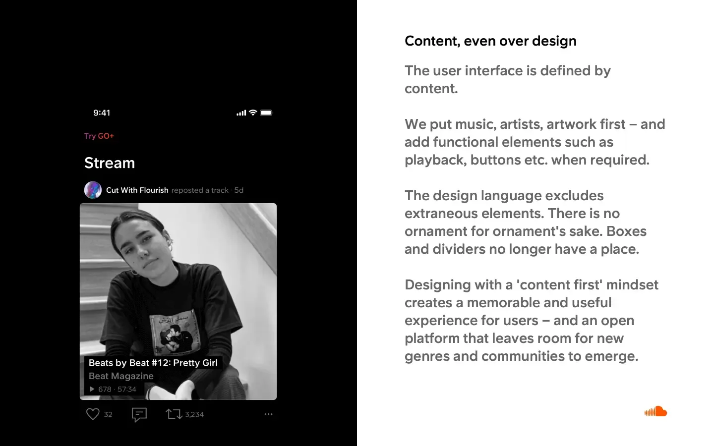
Design principles
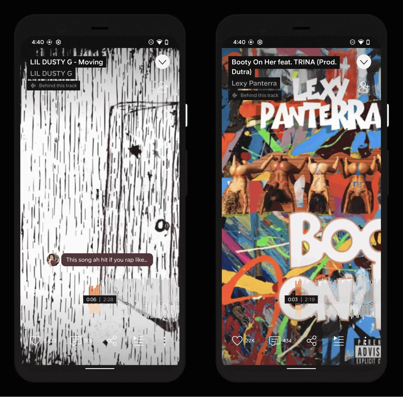
Below are screenshots from the app. Before and after.
You can see how visible these actions are. For the top part, we used secondary buttons instead of the old ghost buttons.
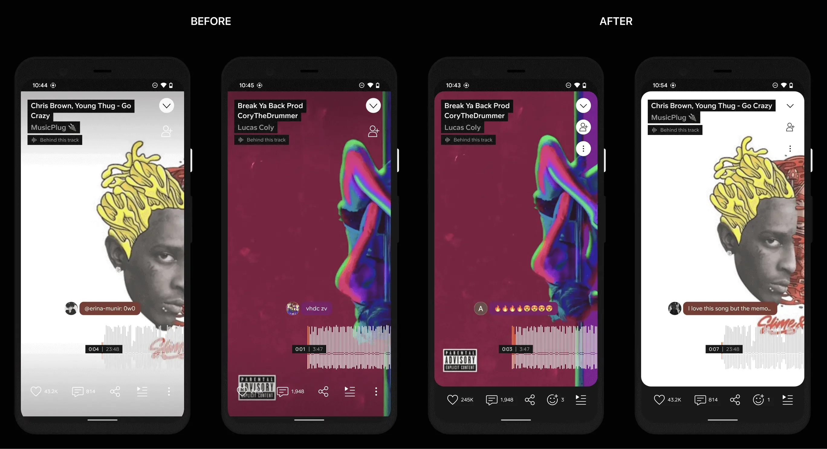
Before and after
FigmaCloud ☁️ to the rescue
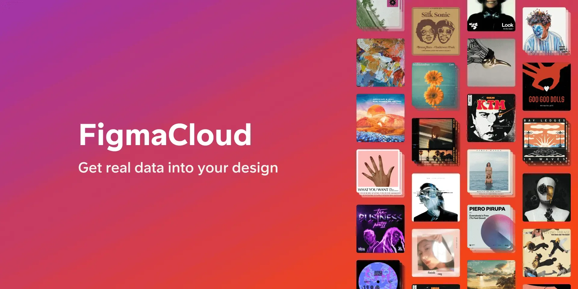
Internal plugin: FigmaCloud
An additional thing I want to mention is that during my time in the design systems team, I've built a few plugins to help designers with their workflow.
FigmaCloud has helped fill in our designs with real data from SoundCloud's API. It's really useful in stress testing our design components against real data. Of course, I used it to make sure my concepts to fix player color contrast will work 😉
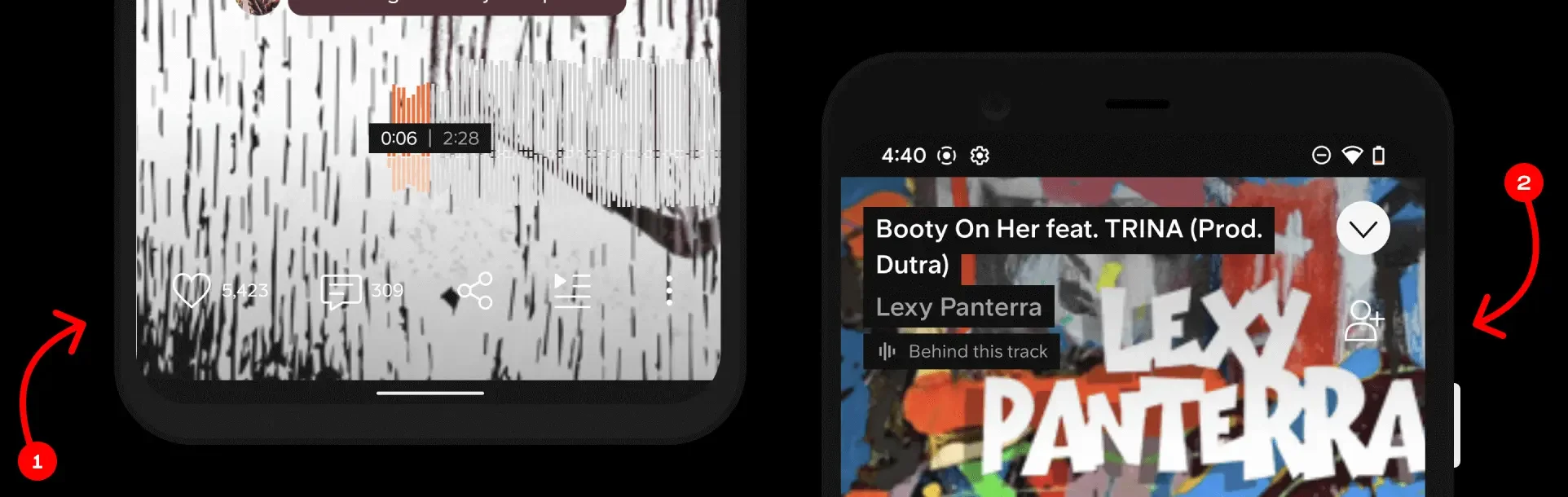
Result
Back to the player, this is the final result which is already built as you can see. The actions are always clear no matter what the artwork is.
Final result after building
Unfortunately, I can't tell u anything about the results of this project. it is very recent and we are actively working on it. Waiting for the experiment to run and see how it performs...
I still can ask what if it doesn't work?
I guess I would try to understand why it didn't work… Go back and try again…